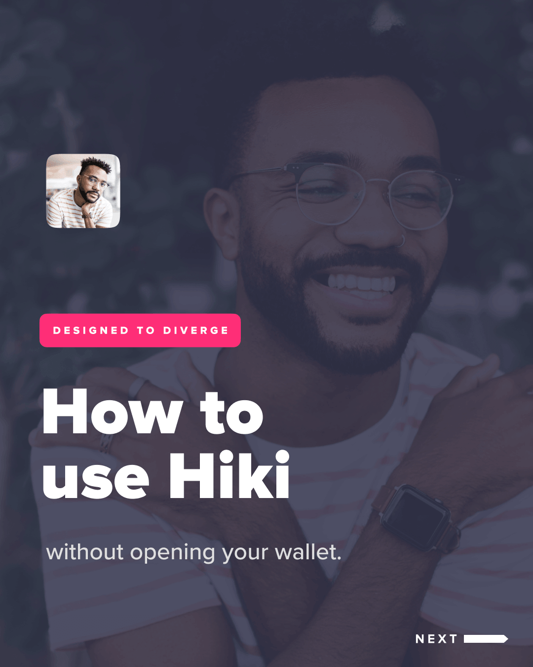
Designing for nervous systems, not user flows
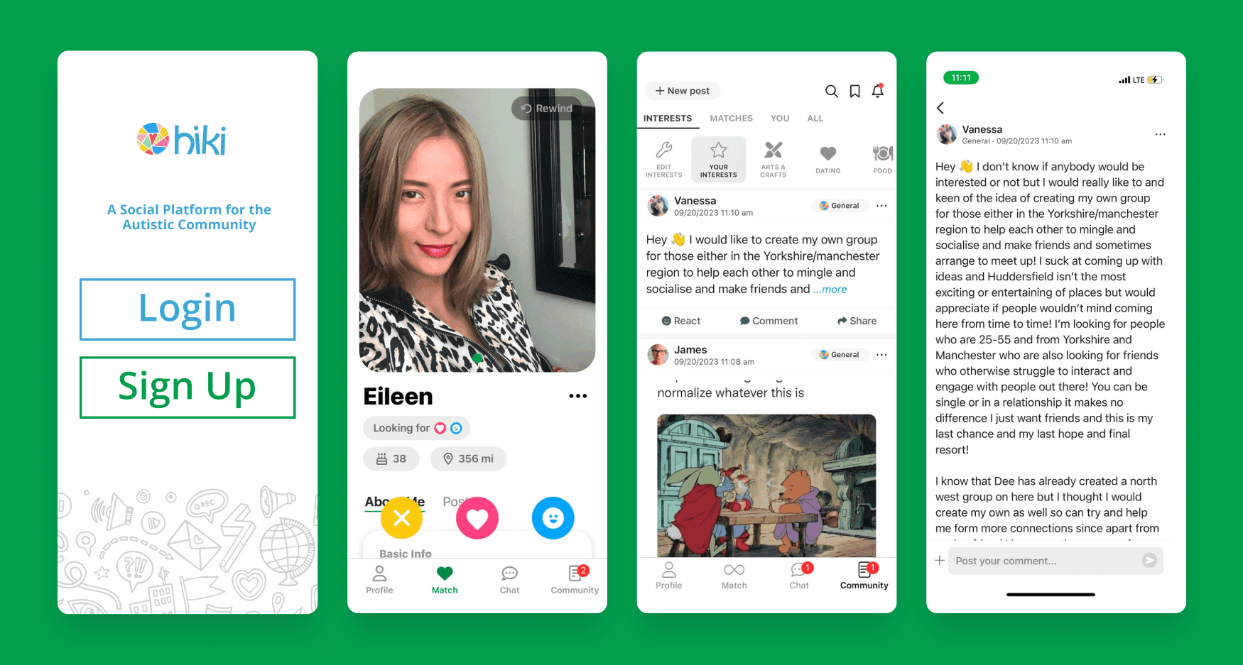
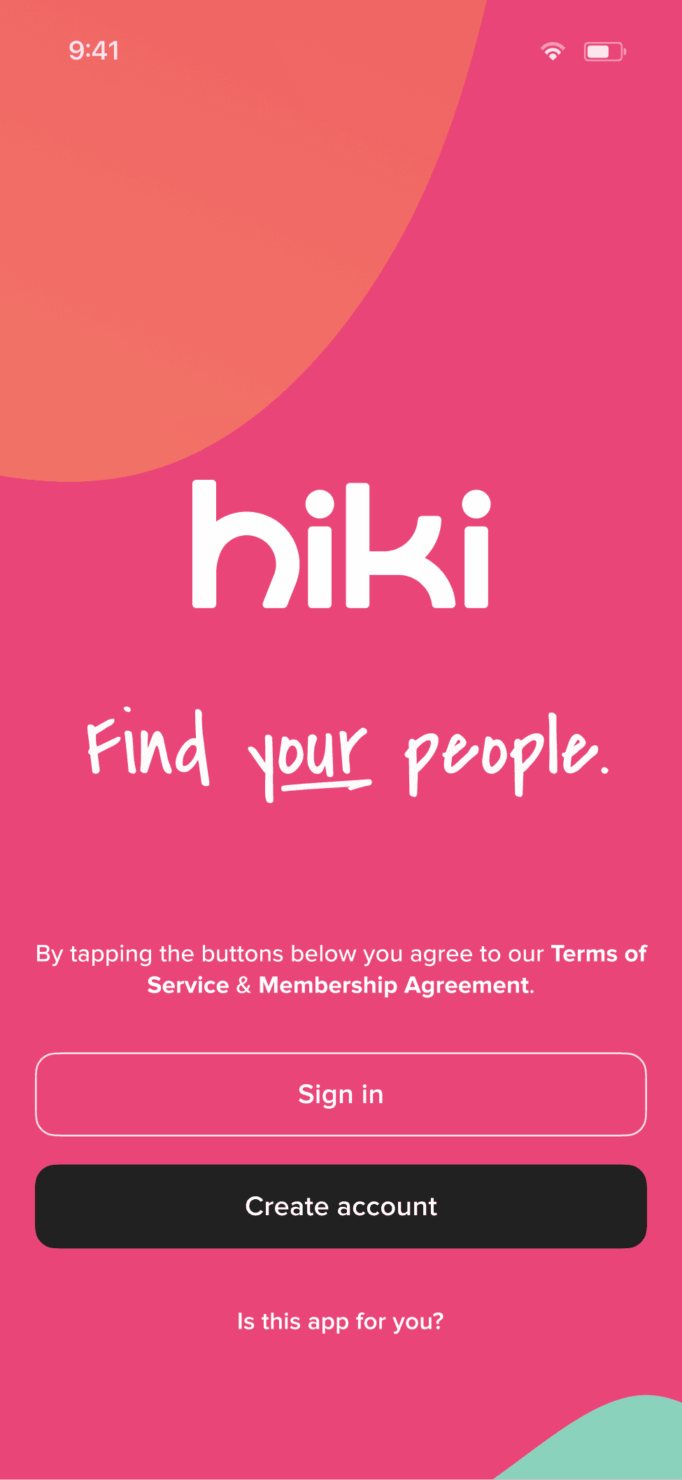
Hiki was a dating platform for neurodivergent adults built on a swipe mechanic its own users couldn't use. As sole designer I rebuilt it from the brand down: 700+ screens across iOS and Android, ND-specific matching, and a monetization model that didn't punish the people it served.
Swipe dating runs on snap judgment under time pressure, the exact interaction autistic people are wired to find hostile. Hiki wore an autism label but ran a Tinder engine. The label was marketing. The mechanics were the problem.
I rebuilt it around how neurodivergent people actually connect, not how dating apps assume everyone does. Kill the swipe. Make profiles readable instead of fast. Put safety one tap from everywhere. Monetize by adding, never by degrading the free experience. The rebrand and 700 screens were downstream of that one call.
3.9x growth. 2.6x revenue. 10:1 LTV:CAC. 350K+ users across 100 countries, plus CBS News. Accessibility wasn't a constraint on the product. It was the product.
The mainstream dating playbook was the product's ceiling. Growth didn't come from a better version of swipe. It came from rebuilding the product around how neurodivergent people actually form connection: slower pacing, compatibility that predicted real fit, and a monetization model that didn't punish the people it claimed to serve. Everything below is downstream of that call.
The before
The app I walked into was a Tinder clone with an autism sticker on it. Swipe-based matching. Generic profiles. No design system. No accessibility beyond the legal minimum.
Nothing about it reflected how neurodivergent people actually connect. The swipe punishes deliberate decision-makers. Profiles rewarded snap judgments that most autistic users can't and shouldn't make. The whole interaction model assumed neurotypical social processing: fast, intuitive, pattern-matched. For a user base where sensory overwhelm is a daily reality, that isn't bad design. That's hostile design wearing a friendly skin.
I was the first dedicated designer. My scope was everything: product strategy, UX, UI, design systems, copy, animation, branding. When I say "sole designer," I mean there was no one to hand a wireframe to. I was the wireframe, the prototype, the pixel-perfect comp, and the redline spec.
The diagnostic surveys
“Why did you leave?”
Reskinned template killed trust. Felt like every other dating app.
“What keeps you here?”
Connection sustains the product. Dating features don't.
“What would make you switch?”
Switch trigger is neurotype-aware UX, not more users.
My first instinct was "how the hell do you plan to make money off this thing?" A community-only social app for a niche audience isn't a business. Dating would be. But before touching anything, I needed to understand why users were leaving and what would bring them back.
I designed a three-segment survey: churned users (why did you leave?), power users (what keeps you here?), and potential users from ND communities on other platforms (what would make you switch?). Not satisfaction surveys. Diagnostic ones. What did you expect when you downloaded this? What made you stop opening it? What would you pay for?
One interview stuck: a churned user I'll call Jake. He'd downloaded Hiki hoping to find people who understood how his brain worked. Left because it felt like every other dating app, just with fewer people on it. No sense that it was built for him. That gap between expectation and experience was the core problem. Users came looking for neurodivergent connection. They found a reskinned template.
The research confirmed what I suspected: community features alone wouldn't sustain the product. But dating had real potential if the interactions were redesigned around how neurodivergent people actually form connections. Slower. More deliberate. More information upfront. More control over the pace.
The redesign
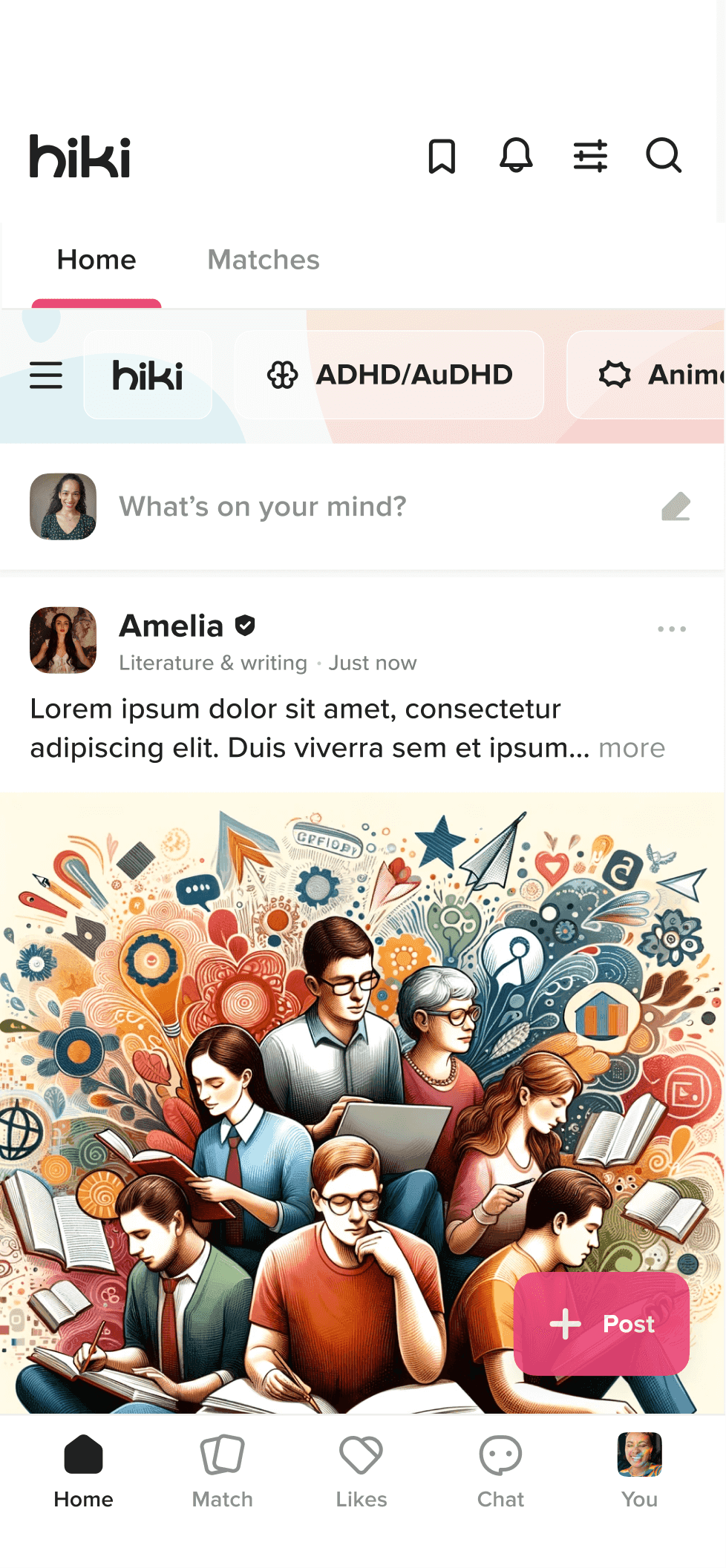
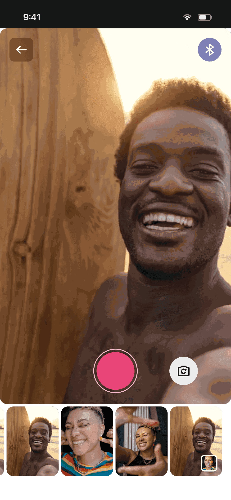
I rebuilt everything. 700+ screens across iOS and Android. New brand. New design system. New interaction model.
Accessibility as foundation, not accommodation
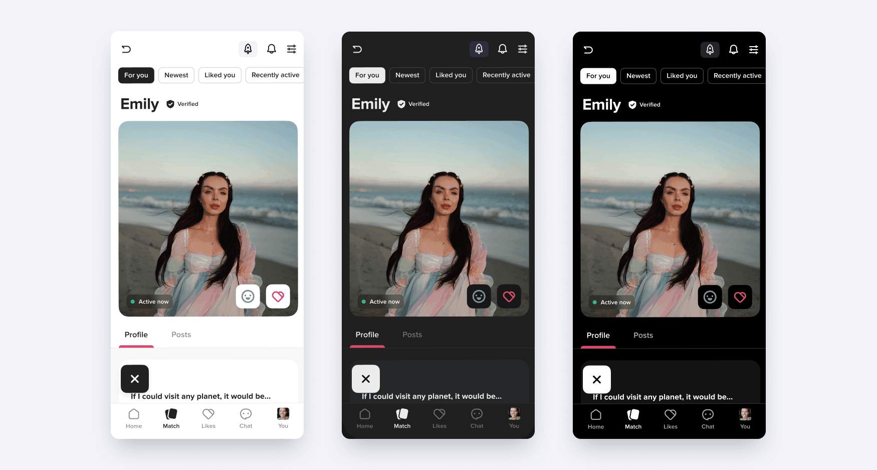
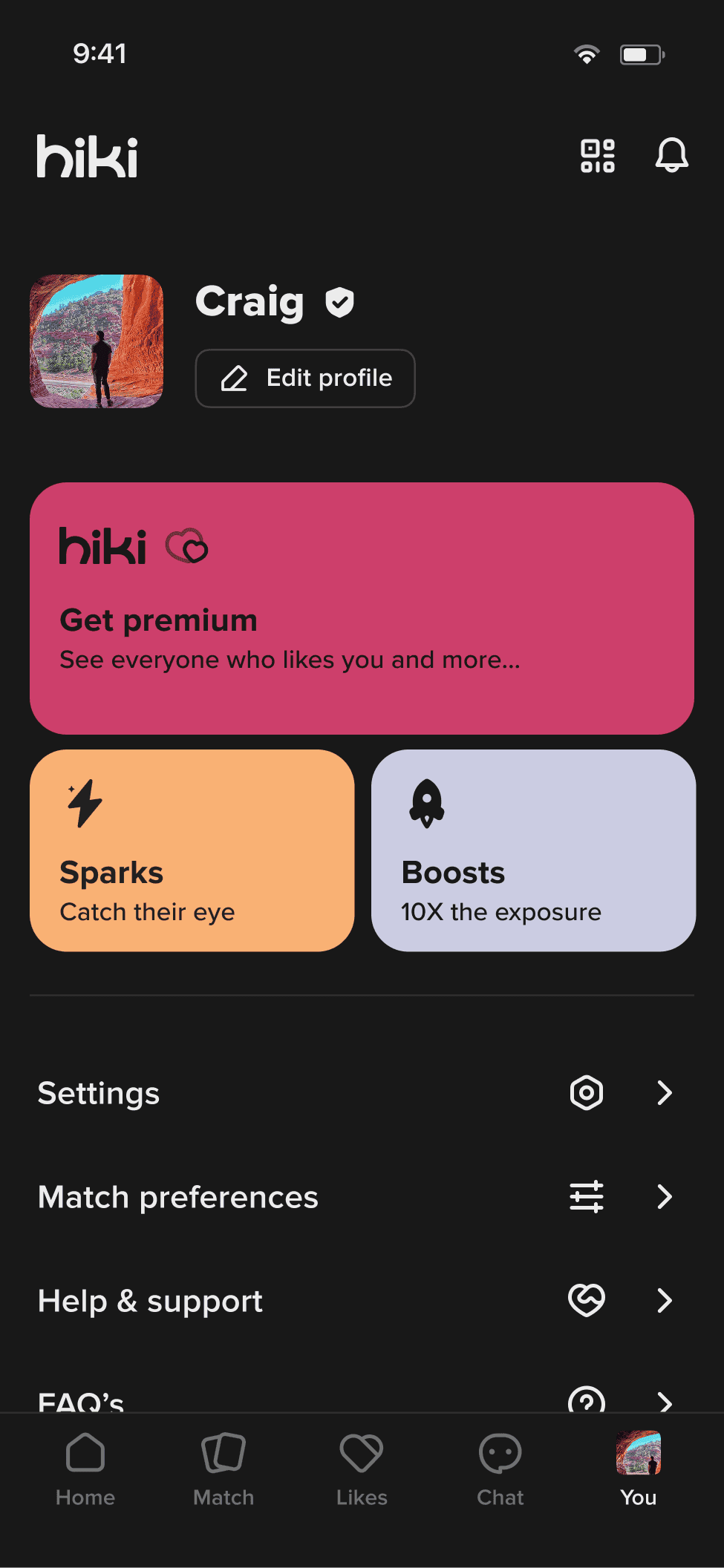
Three theme modes: light, dark, and high-contrast. Each one shaped every component from the start, never relegated to a settings toggle. The design system treats all three as equal citizens.
Beyond color: no fast or sudden movements anywhere in the UI. Every animation respects prefers-reduced-motion. No auto-playing media. Interactions are consensual by default, meaning nothing happens to your profile, your visibility, or your notifications without you explicitly opting in. For this audience, unexpected UI shifts can trigger genuine distress.
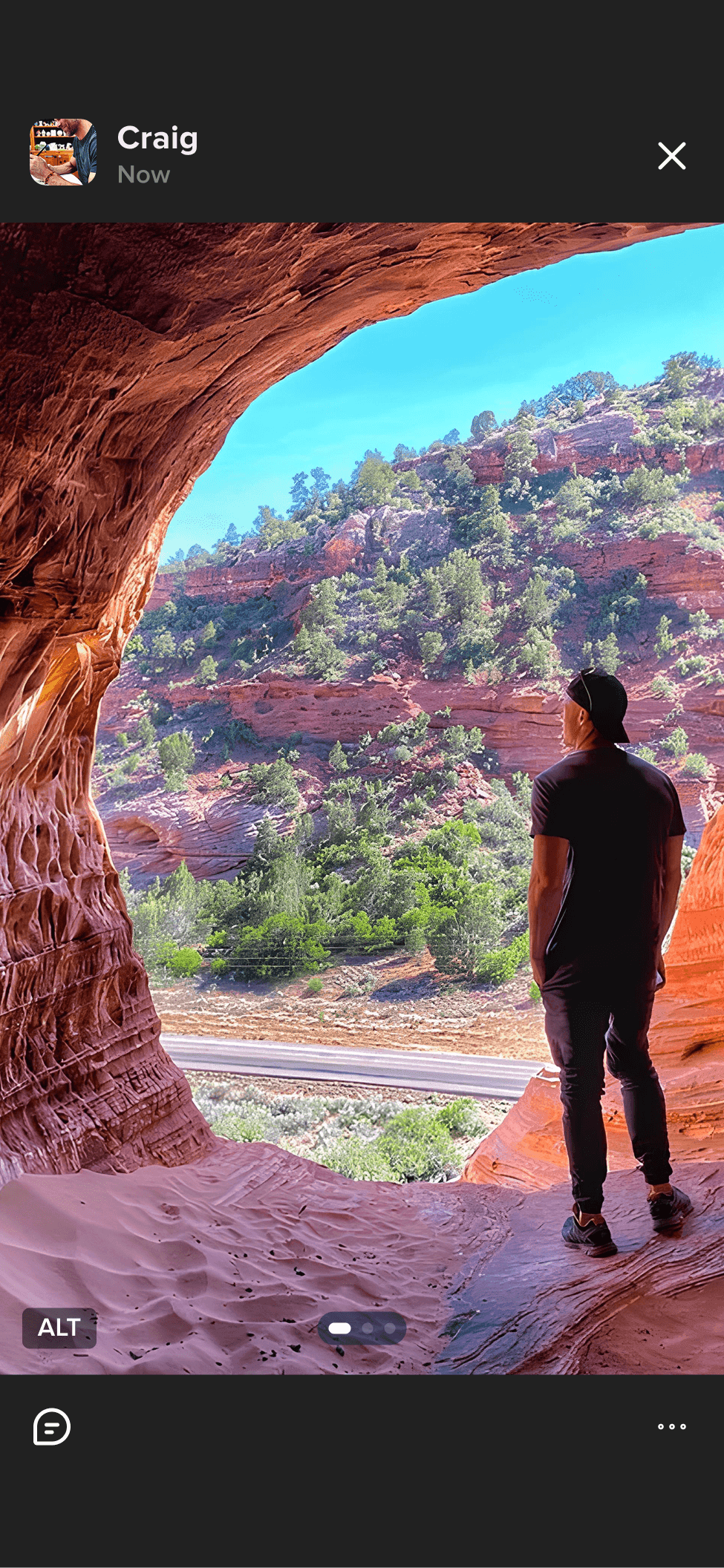
Killing the swipe
Kill the swipe entirely. Snap judgments under time pressure are structurally incompatible with autistic social cognition — the core mechanic was the core problem.
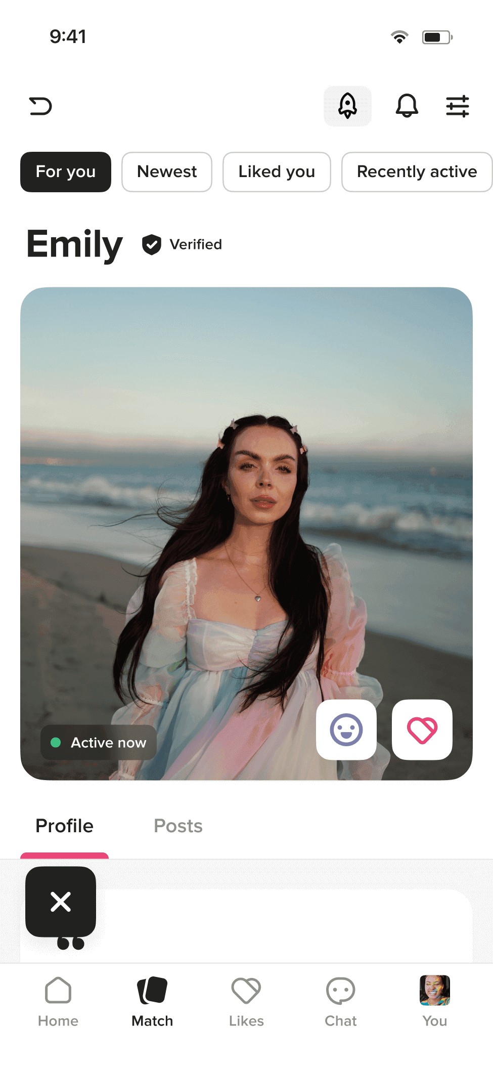
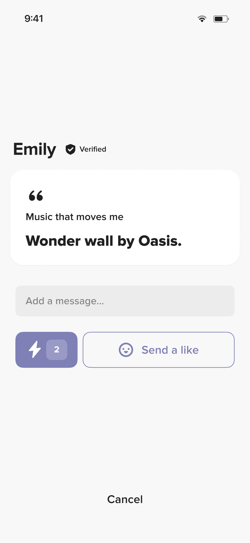
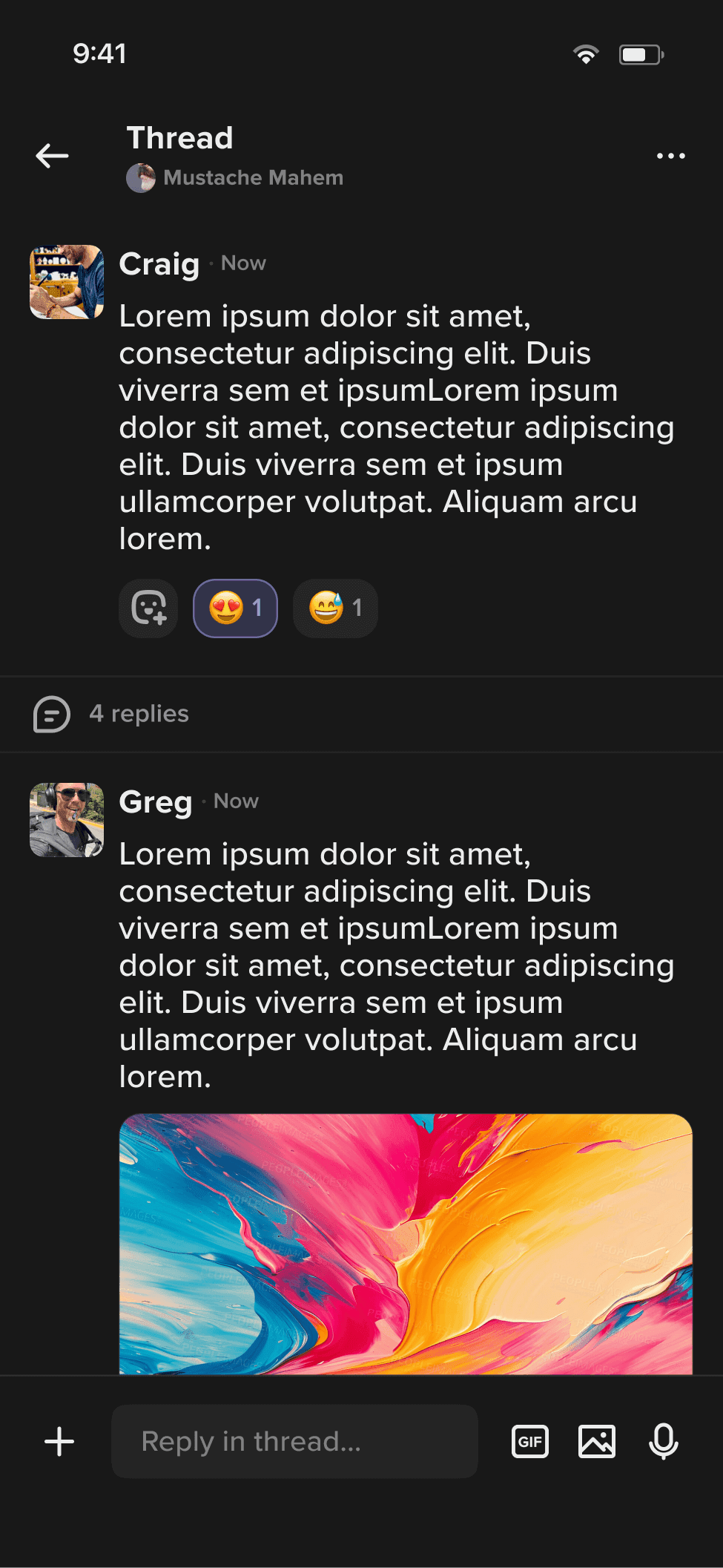
I killed the swipe mechanic entirely. Replaced it with scroll-based browsing where profiles are richer, longer, and designed to be read rather than snap-judged. You scroll at your own pace. If you're interested, you like them. A like triggers the ability to message. No unsolicited DMs. No pressure to respond instantly.
Swiping optimizes for volume and speed. Neurodivergent users need more information before making social decisions, not less. The scroll model gives them that space.
Slower onboarding and a lower like rate per session. Taken deliberately — the users swipe was bringing in weren't the ones worth keeping.
Matching on how brains work, not demographics
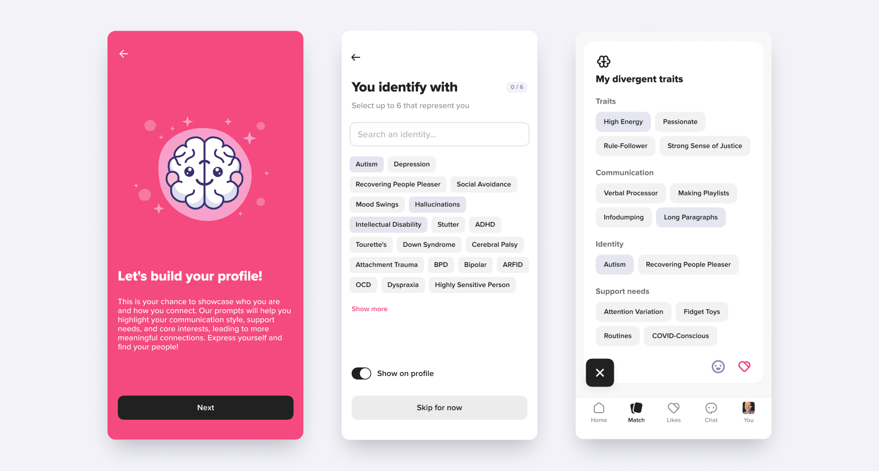
The matching system uses four neurodivergent-specific filter categories: identity (how you identify within the ND spectrum), communication styles (how you prefer to interact), special considerations (things a potential match should know), and special needs (specific accommodations or boundaries). Users fill these out during onboarding, not as an afterthought in settings.
This lets users find people whose neurotype, communication preferences, and boundaries are compatible before a single message is exchanged. It reduces the social guesswork that makes dating apps exhausting for ND users. You match on how your brains work, not demographics.
Control at every interaction
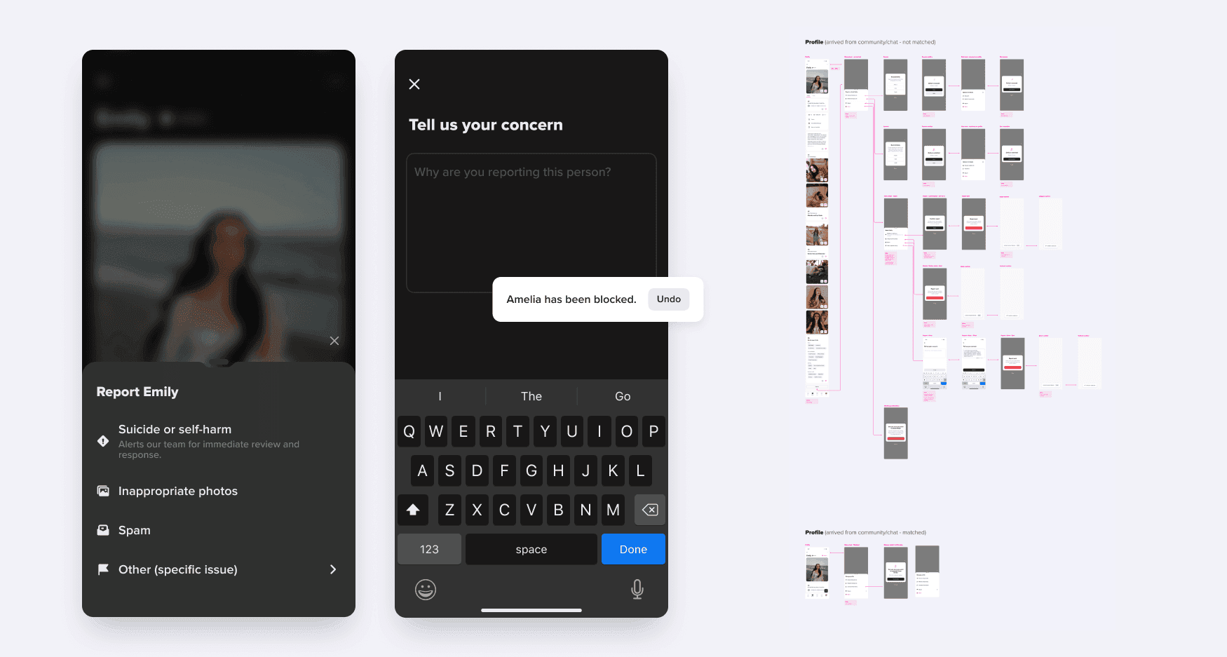
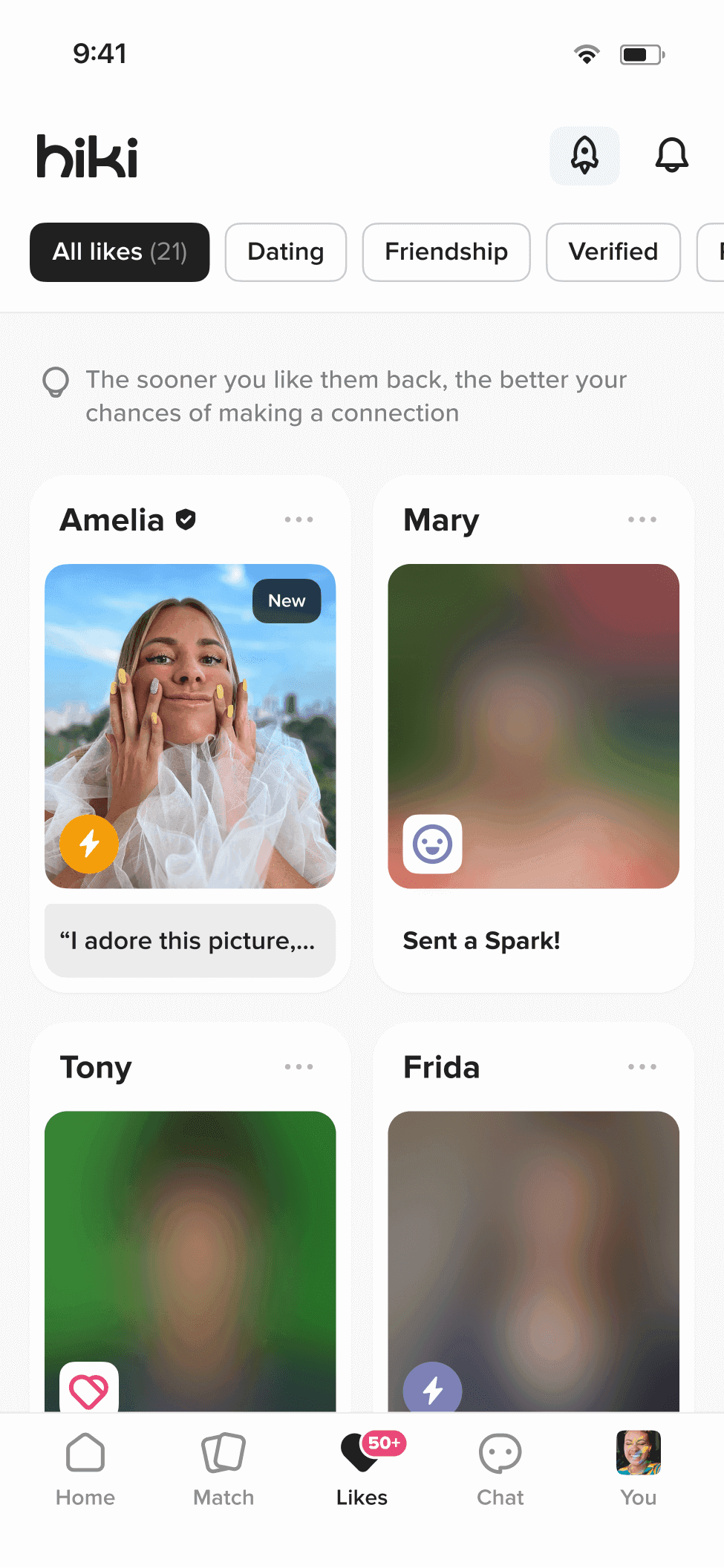
Blocking and snoozing built into every interaction point. If someone makes you uncomfortable, one tap and they're gone. Snooze mode lets you take a break from the app without losing your matches or conversations. Privacy controls let you manage exactly who sees what on your profile. For a user base that includes people with trauma histories, sensory processing differences, and social anxiety, these aren't features. They're prerequisites.
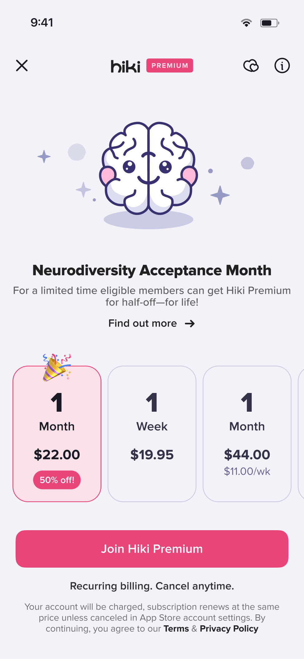
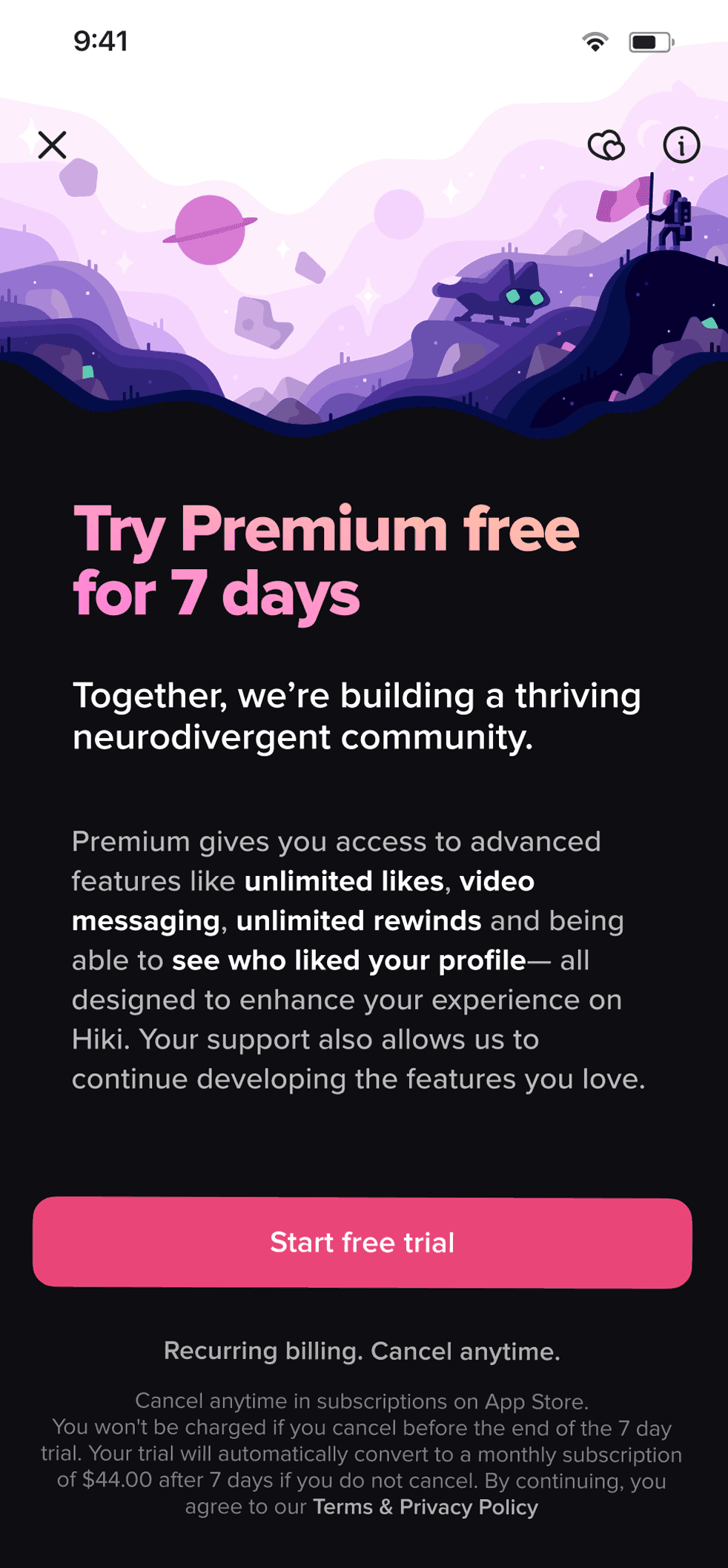
Monetization without betrayal
The hardest design problem wasn't the UI. It was the business model. How do you monetize a dating app for people who've been exploited by every other dating app's monetization?
The principle I landed on: never take something away to sell it back. The familiar trap in dating app monetization is that the free experience gets deliberately degraded to push upgrades. I designed it the opposite way.
The free experience is better because of its constraints, not despite them. A daily like limit forces you to be deliberate about who you engage. For neurodivergent users that maps to how they already want to connect: slowly, with intention, on real compatibility instead of volume. The limitation is the design.
Paid features are shortcuts, not unlocks. More likes, priority visibility, advanced filters. Things that save time for users who want to move faster, but don't degrade the experience for users who don't pay. Community features stay free. Period.
Why we chose a hard cutover
I considered a gradual rollout. Phased features, A/B tests, slow migration. Then I chose the opposite: rip the bandaid.
For this audience, gradual means unpredictable. Half the app looks new, half looks old. The interface you learned yesterday changed today. For users sensitive to environmental changes, that's worse than a clean break.
So we shipped everything at once and over-communicated the hell out of it. In-app education explaining what changed and why. Onboarding that walked existing users through the new system at their own pace. The framing mattered: this isn't change for the sake of change. This is the app finally becoming what it was supposed to be.
The risk was real. Power users had muscle memory on the old app, and a subset of them felt disoriented for the first week. The in-app education recovered most of them. The alternative, a phased rollout with half the app changing while they used it, would have been worse.
Results
3.9x user growth. 2.6x revenue. 10:1 lifetime value to customer acquisition cost ratio. Product choices built specifically for neurodivergent users outperformed the template conventions the old product was copying. The niche was the wedge, not the ceiling.
The app went from a niche autism-only product that Newsweek and NBC covered at launch in 2019 to 350,000+ users across 100 countries after the redesign. CBS News ran a story about a couple who met on the platform and got engaged. That kind of press doesn't happen to apps with bad UX.
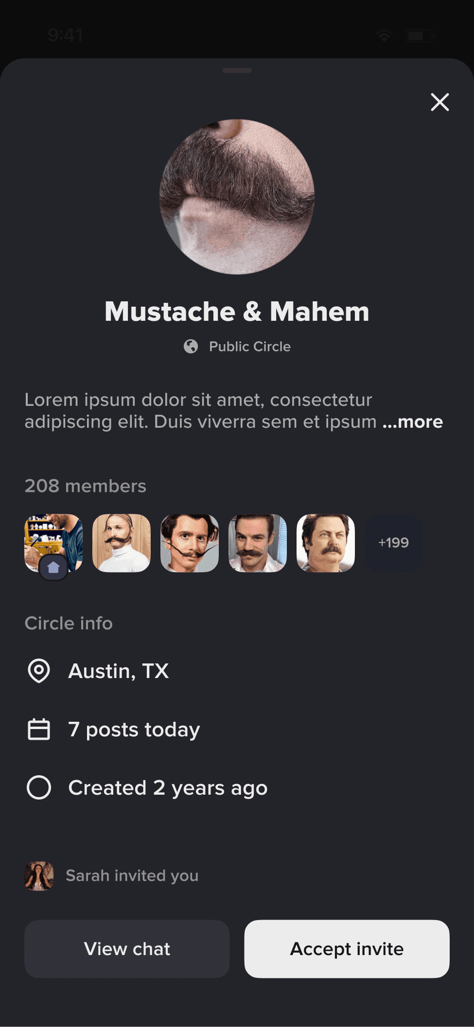
Groups (ongoing)
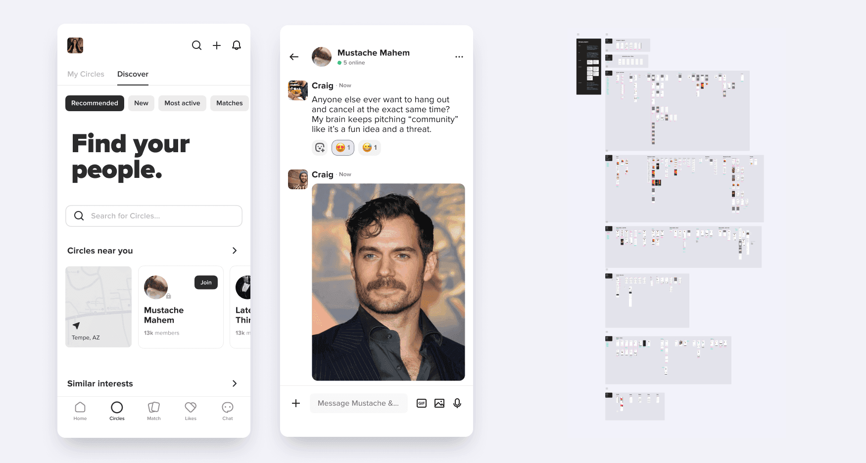
My most recent project for Hiki is a full Groups system shipping soon. The community side of the app needed the same level of design rigor as the dating side. Groups introduces circles (public, private, and secret), a commenting system with threaded replies, emoji reactions beyond just likes, voice messages, GIF integration, and tag-based discovery. Circle privacy controls, member management with approval flows, and content moderation tools. The same consent-first, safety-aware principles applied to a new interaction surface.
This work is still in progress, so I'm keeping details light. It's the natural extension of the redesign: if you're going to build a neurodivergent social platform, the group experience needs to be as thoughtful as the individual one.
The personal dimension
I'm AuDHD. Autistic and ADHD. I'm not sharing that for sympathy or to perform relatability. It's a methodological fact. I designed this product from inside the experience it serves.
Lived experience of sensory overwhelm, rejection sensitivity, and executive function challenges informed decisions that user research alone wouldn't surface. The research wasn't bad. Users often can't articulate what their nervous system needs until they experience the alternative. You can't find "I need scroll-based profiles instead of swipe cards" in an interview. You find it by understanding that snap judgments under time pressure are fundamentally incompatible with how autistic social cognition works.
The ND filtering categories came from the same place. No user asked for four-axis neurodivergent matching. But I know from lived experience that "are you neurodivergent?" is a useless binary. The question that matters is: how does your neurodivergence show up in relationships? That's what the filtering system answers.
What I'd do differently
I never proved the redesign brought churned users back. We captured why they left. We never tracked whether they returned. "Anecdotally, yes" is what you say when you didn't build the measurement in, and I didn't. If the whole pitch is that this product retains people the old one lost, that's the number I should be able to show and can't.
And the all-at-once rollout cost some power users a bad week. The over-communication recovered most of them, but "most" is doing work in that sentence. I still think the clean break beat a phased rollout for this audience. I'm less sure than I sound that a hybrid would have been worse, and I never ran it, so I don't actually know.
Hiki
Everything described above is shipped. 350K+ users across 100 countries.