

Case studyBuilding a motivational profile.
iFit’s new profile experience motivates user to ‘move’—using data, identity, and behavior loops—creating a space they actually want to return to.
overviewiFIT is a subscription-based platform and app that provides interactive at-home fitness workouts, led by expert trainers, on a variety of fitness equipment.
This case study walks through how I redesigned the user profile—adding visual feedback, personalized streaks, and goal framing to make it more useful, more human, and more habit-friendly.
deetsRole / Lead Product Designer
Timeline / 8 weeks
Platforms / Treadmill, Bike, Elliptical, Rower—embedded tablets
Deliverables / UX flows, high-fidelity mockups, dev-ready specs
The challenge.
The old profile logged effort. The new one celebrates it.
This redesign reframes fitness as momentum, not just metrics.
01. the kickoff
01.Starting point.
The original profile was minimally sound—but behaviorally flat.
It showed data.... But it didn’t feel like progress, and it wasn’t something users wanted to revisit.
It lacked clarity, emotional feedback, and momentum.
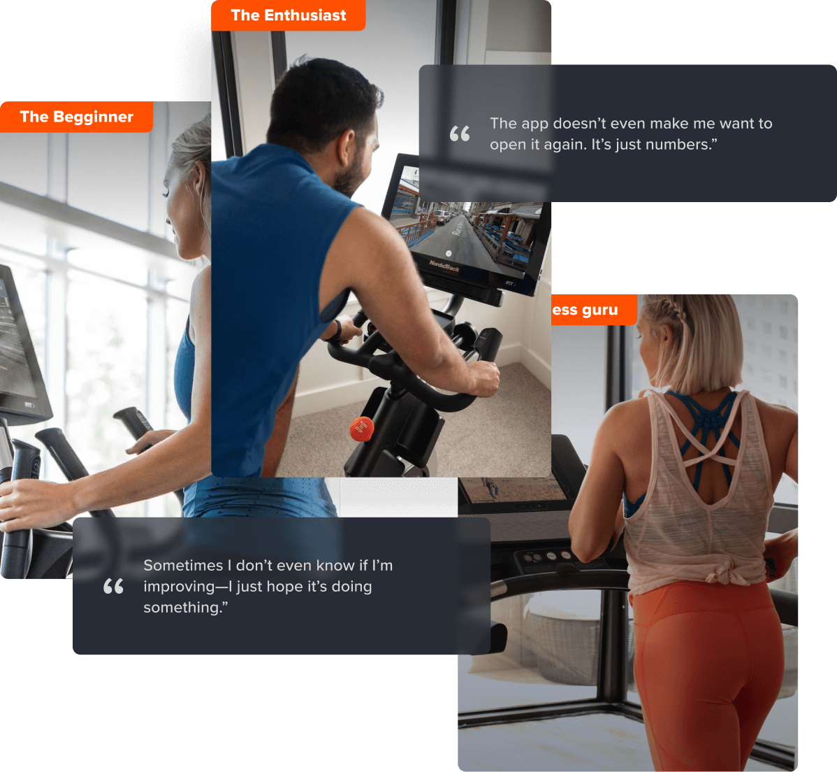
01.Understand the users.
iFit serves everyone from uncertain first-timers to performance-focused enthusiasts. Research uncovered three universal needs:
A clear, visual sense of progress
Motivation through streaks and consistency
A profile that felt personal, not just functional
This insight informed me in changing the profile from a stats page into a motivational system.
01.Gloves off design exploration.
With clear goals in place, I jumped in to an exploration phase—testing layout systems, motivational loops, habit building and various ways of encouraging consistency.
Some paths went minimal. Others went big on reward and identity systems. All of them kinda brought us to one point:
We needed a profile that knew the user, and knew what motivates them.
-
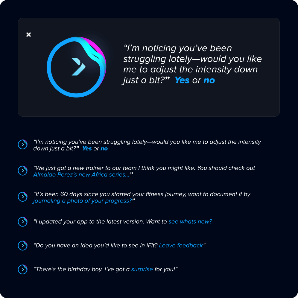
![AI feedback.]()
AI Coach.
Giving both real time and stat based feedback.
-
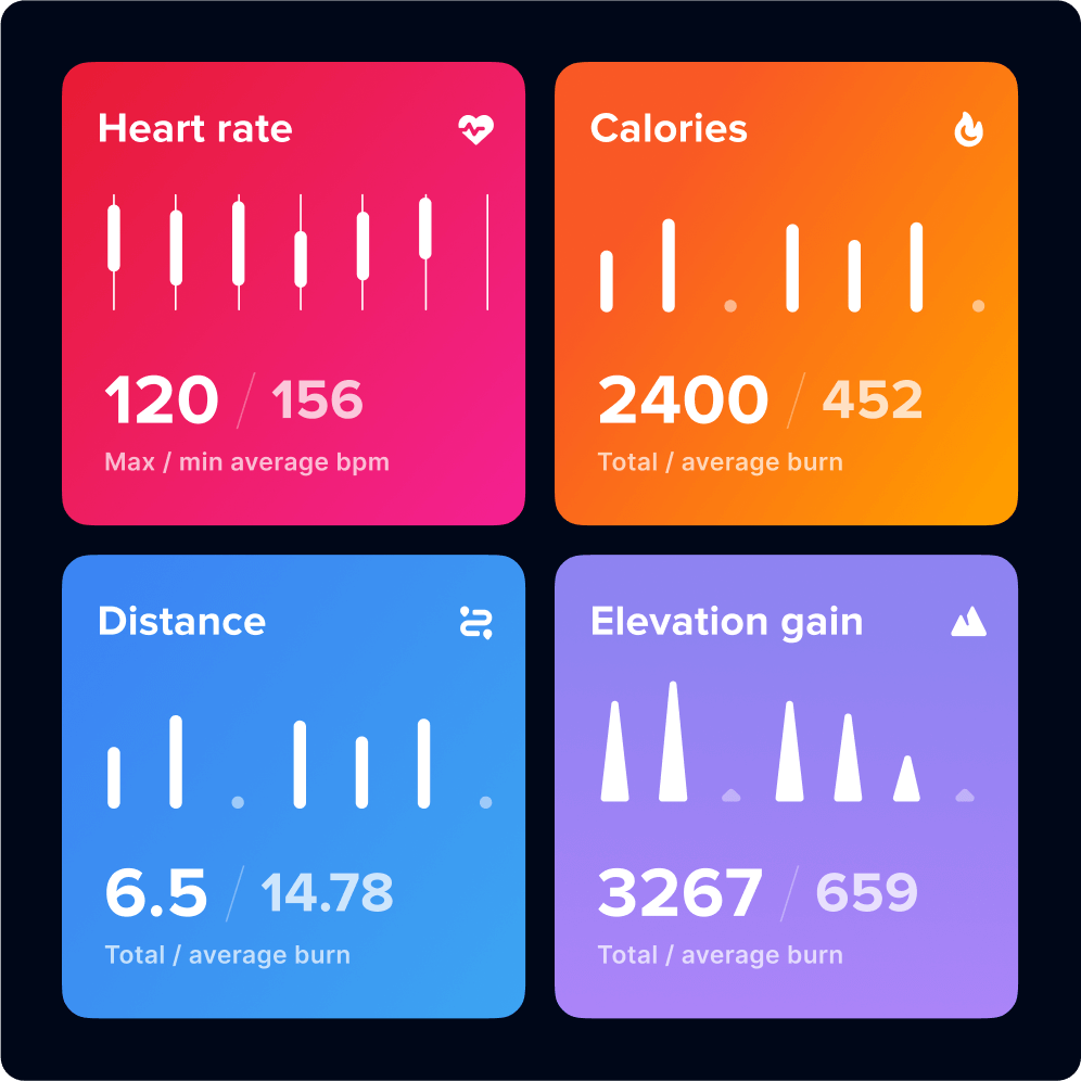
![Stats.]()
Stats
Visual exploration.
-
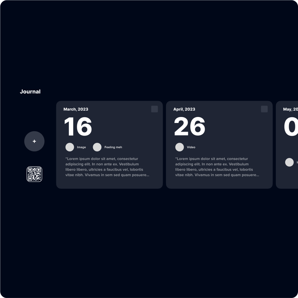
![Journaling.]()
Journaling.
Integration with the mobile app to track daily progress.
-
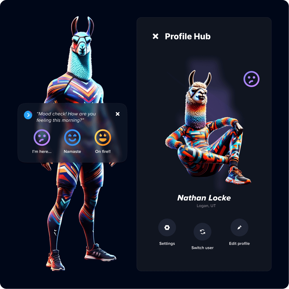
![Mood tracker.]()
Mood tracker.
Low effort mood tracking and trends to inform workout suggestions and AI tips.
-
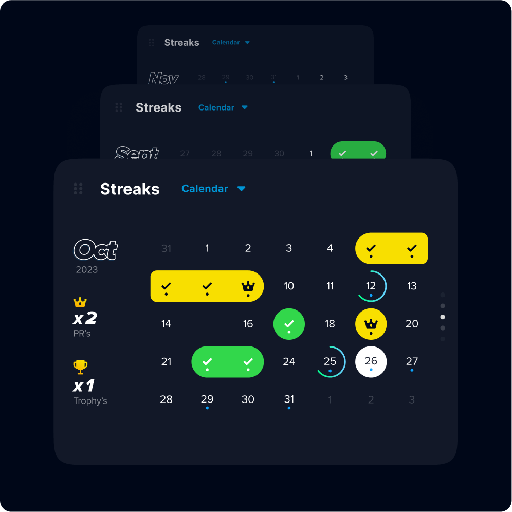
![Streaks & calendar.]()
Streaks & calendar.
Quick visual representation of progress, streaks and what to expect.
-
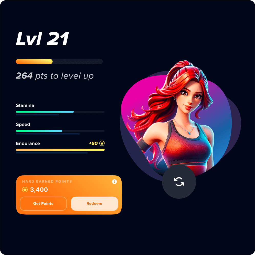
![Rewards & gamification.]()
Rewards & gamification.
Point accrual and redemption system—also treating their stats as game metrics.
01.Pairing it down to the most promising directions.
After exploration we narrowed the scope to two main areas, profile summary and workout history—scaling back AI integration, social integration and rewards.
Profile summary.
Scaled back profile imagery
Profile details, including bio and personal stats
Ability to easily switch users
Access to Milestones & settings
Stats summary with date range selection
Display trends
Add streaks to stats view
Show recent activity
Show user generated workouts
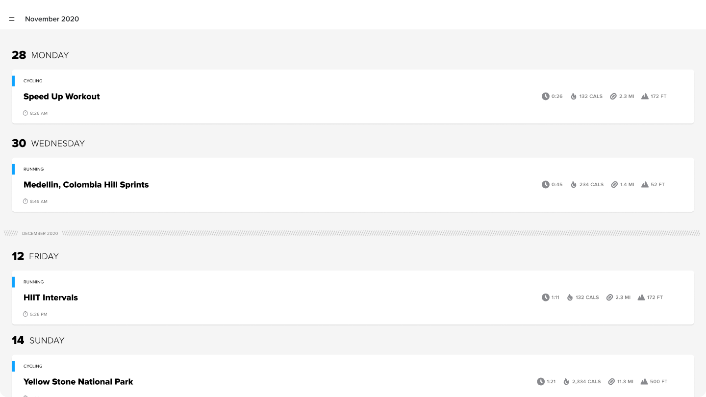
Workout history.
Show total workouts in workout categories
Showing historical workouts
Show streaks
Design workout details card
Sorting and filtering
Favoriting and redos
02. ‘summary’ solutions
The heart of the profile.
Showing users what they’ve done—and why they should keep going.
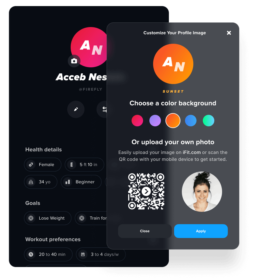
02.Profile details.
I anchored the user’s identity with a personal profile card—highlighting who they are, what they’ve done, and where they’re going next—adding a mobile for customization.
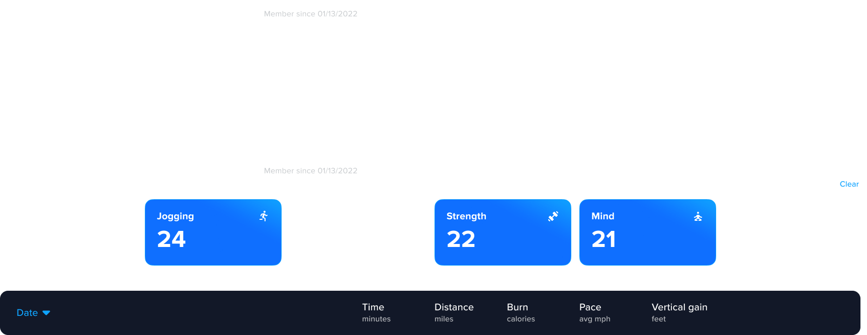
02.Data visualization.
I built out the workout data into glanceable, intuitive visualizations.
Each card supports at-a-glance motivation while working across screen sizes and machine types—from treadmills to bikes.
02.Trends.
By surfacing week-over-week patterns, I gave users insights into their progress.
Trends help users recognize momentum, spot plateaus, and adjust without guesswork—giving users a reason to come back and keep moving.
03. ‘history’ solutions
Context with consistency.
Built for patterns, not just records.
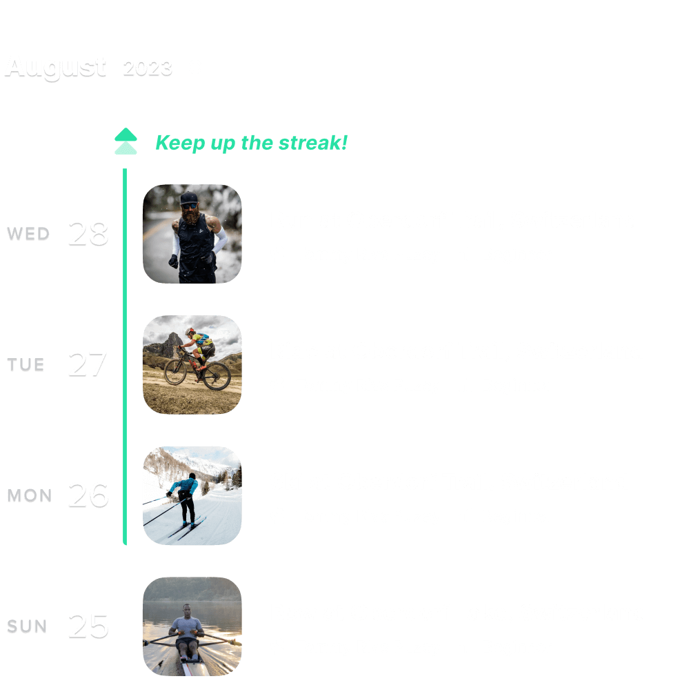
03.Workout cards & visual feedback.
Building on the motivational system from the summary view, we carried streak-based encouragement into the history layer.
New workout cards show:
Streak status and completion progress
Visual stats for quick comparisons
Actions for repeat, favorite, or dive deeper
Instead of just showing effort—we show patterns and progress.
03.Combining Count with Context.
I combined workout count and category filtering into a single, flexible interface—one that highlights patterns without overwhelming the user.
Users can sort by equipment type, time period, or activity mix
Visuals adapt across screen sizes with no loss of clarity
Filters behave more like reflection tools than data toggles
A filter bar that’s intuitive enough for casual users—detailed enough for the workout warriors.
04. artifacts
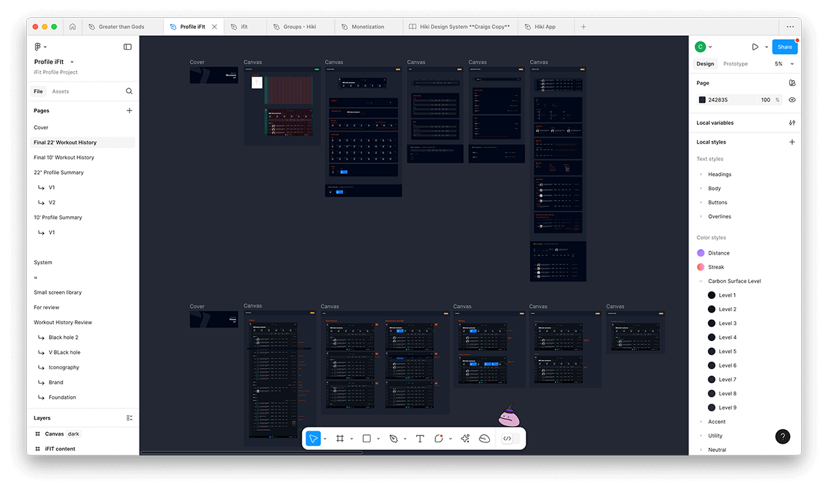
04.Handoff
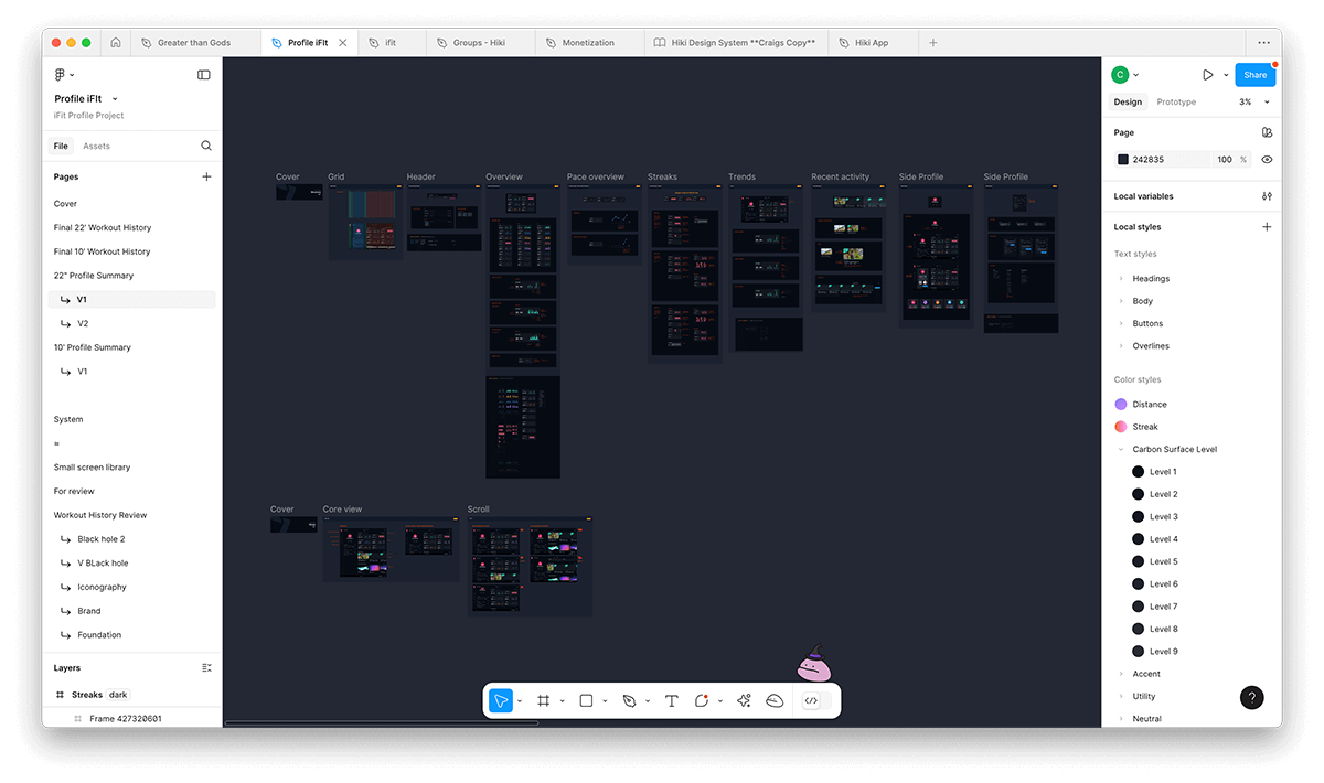
After several review rounds, I finalized the full set of components, states, and flows inside Figma.
I organized the workspace to support engineering handoff—layering in annotations, edge cases, and fallback states, including:
Interaction logic
Screen size & machine type responsiveness
Empty states and error handling
Developer notes for logic or constraints
My goal was to make it “ready to scale.”
05. retrospect
05.Looking back.
This was a fun project, an opportunity to work on iFit again, and bring to life some of the ideas I’ve been holding for a while. The behavioral psychology aspects were right up my alley.
What went well.
Team communication and a shout out to a responsive stakeholder and product management team.
Leveraging the existing design system and expanding it.
Expanding the first part of the project to any idea, and then narrowing that to fit timelines and resources.
What I’d do differently.
Spend more time gathering and evaluating user sentiments.
We leaned into intuition and internal insight; next time, I’d insert earlier qualitative feedback rounds.
Testing, testing, testing—validating design decisions. Having more of a real-time pulse on the iFit users.