
Case StudyNeurodivergent by design.
As the sole designer, I tackled Hiki's end-to-end evolution—redesign, rebrand, accessibility overhaul, and monetization—for a user base I’m part of.
Success metrics3.9x user growth
2.6x revenue growth
10:1 LTV:CAC ratio
overviewHiki is a social app built to enable neurodivergent adults to connect, date, and form communities.
I guided Hiki's transformation from a dating app focused solely on autism to a scalable, inclusive platform for the broader neurodivergent community. This involved a fundamental rethink of its voice and identity, streamlining core interactions, expanding its feature set, and implementing a monetization strategy that felt organic to the user experience.
deetsRole / Product Strategy, UX, UI, Design Systems, Copy, Animation, Branding
Timeline / May 2023 – Jan 2024
Platforms / iOS & Android
Team / Collaborative with founder + dev team
The challenge.
For neurodivergent users, pressure feels louder, friction hits harder, and trust takes time.
So when it came to monetization, the challenge was that it had to feel supportive—not exploitative.
01. discovery
01.Listening and understanding who we were building this for.
I sent surveys to active users, social media followers, and people who had downloaded and left. Over 170 users responded.
😕
The app was misunderstood. Features got lost.
“Social platforms are hard for me to figure out… I didn’t realize Hiki was more than a dating app.”
👀
The biggest blocker? No one nearby.
“The app is fine. Just not enough people where I live.”
✅
They wanted more than romance. They wanted safety.
“I just wanted a space where I could belong without explaining myself.”
😵💫
The UX worked. But not for them.
“I want to mark notifications as read without clicking four things.”
01.What we took from this.
Recenter the app around neurodivergent connection, not just dating
Add clarity with better onboarding and copy
Improve filtering and personalization without overwhelm
Expand profiles to include more inclusive neurodivergent traits
Prioritized low-friction safety controls to reduce stress and decision fatigue
Design monetization to feel optional, supportive, and shame-free
02. the foundation
The core of Hiki.
Redesigning Hiki to feel broader, safer, and still like home.
02.What I had to start with.
The old.
Built for autistic dating—but the app didn’t explain itself. Most users weren’t sure what it was or who it was for.

02.The rebrand.
New skin. Same heartbeat.
I redesigned the identity to feel broader and more grounded—without losing what longtime users already trusted.
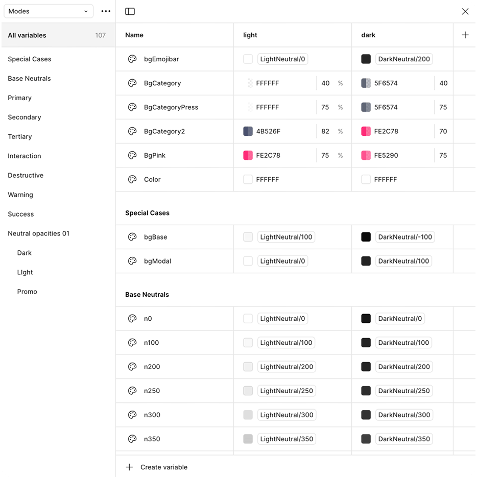
02.The design system.
Building scalable structure.
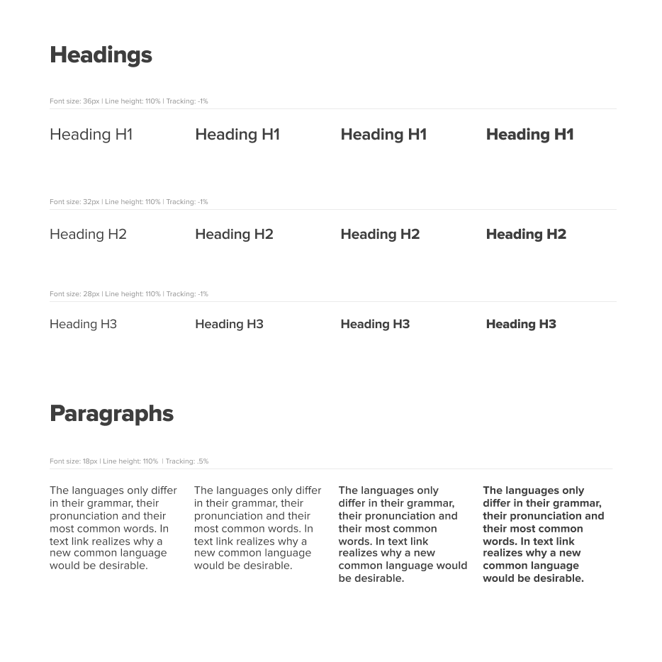
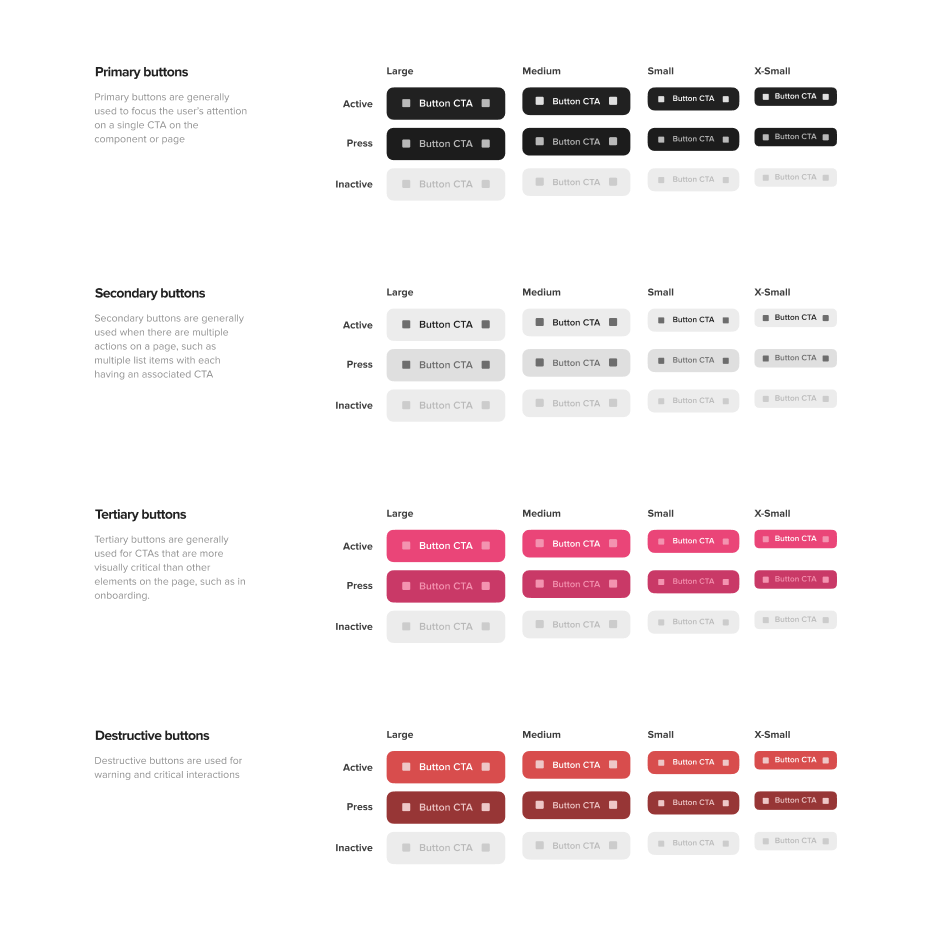
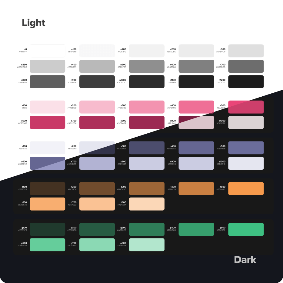
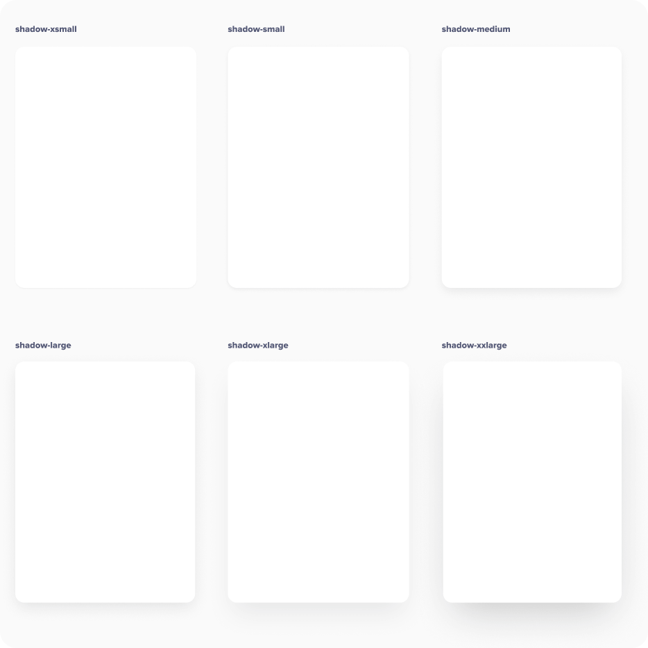
I built a responsive system for light, dark, and high-contrast modes—designed to be fast, calm, and consistent.
03. the shift
Neurodivergent by design.
Redesigned to build trust, reduce overwhelm, and give emotional safety.
03.UX and safety.
Comfort first. Clarity always.
Rebuilt flows like blocking, snoozing, and reporting to be simpler and easier to find.
Community came first—dating came second.

03.Matching and profiles.
Slowing the pace of connection.
Instead of quick swipes, users explored deeper profiles and sent thoughtful likes—with context.
Each profile included:
Longer bios and dispersed photos
Optional audio and video prompts
Like-by-module (photos, prompts, etc.)
Message encouraged before sending a like

03.ND identity & filtering.
Reducing the need to explain yourself.
Users could tag traits, support needs, and communication styles—then filter by them.
It made self-expression easier, discovery more accurate, and spared people the emotional labor of starting from scratch every time.

04. careful monetization
Being extra-super-incredibly gentle.
Monetization designed to support—not subtract.
Revenue grew over 2.5x without alienating the community.
04.The strategy.
Paid tools that respected boundaries.
I limited monetization to dating-only features—like boosts, sparks, and seeing who liked you.
Community features stayed free on purpose.
Friction wasn’t a bug. It was intentional.
04.Tone & transparency.
Clear language. Honest intent.
I designed the paywall to feel calm, clear, and optional—no dark patterns, no surprises.
A 7-day trial, scholarship system, and open invitation to ask questions made sure no one was left guessing—or left out.


05. the wrap up
05.Pulling it all together.
From research to rebrand, I touched every part of the product—UX, UI, strategy, flows, animations, illustrations and systems. What started as a niche app became a broader, safer space built for real connection.
05.Artifacts handoff.
Over 700 screens—including edge cases and empty states—were delivered in Figma, complete with flow maps, component usage, and embedded Lottie in-app animations to support a smooth, guess-free dev handoff.
06. release, reception & results
06.The first wave.
Neurodivergent users don’t sugarcoat.
Of course people hated it at first. Change was uncomfortable—especially here. But after a few weeks, the same users who pushed back became the ones defending it.
😡
“All but ruined. Changes in recent months/last year or so have left the app bifurcated into an all too often toxic free section, and a paid section where one can actually speak to people they might align w[ith].”
— F.O.
😊
“Super easy to navigate user interface. Curated feeds, so you only see the type of content you want to see. This app is what many people wish the mainstream socials were, but it's even better because it's full of other neurospicy people to relate to.”
— C.K.
😍
“Cuteee! Love the new branding colours ♥.”
— H.A.
06.Adaptation and traction.
The model worked.
After the redesign, growth accelerated without compromising trust:
User base increased by nearly 300%
ARR more than doubled in three quarters
Trial conversion reached nearly 10%
Paid upgrades closed at ~20%
LTV:CAC ratio exceeded 10:1
These shifts validated the tone-aware monetization model and showed it could scale responsibly.

07. retrospect
07.Looking back.
One designer. One community. A thousand moving parts.
I underestimated the weight of building in isolation—no partner to test ideas, no shared kickoff, no strategy doc. Just me, moving fast, trying to make something people would actually use.
The scope was too broad, the timeline too tight. It worked—but it could’ve been better.
What went well.
Rebuilt the app to reflect what the community actually needed—clarity, safety, connection
Designed a fully scalable, accessible system that shipped cleanly
Balanced monetization with honesty, not pressure
Navigated emotionally intense feedback without losing the thread
What I’d do differently.
Require a kickoff doc so everyone starts aligned
Push for more user testing before launch
Narrow the scope earlier to allow real refinement
Ask for support sooner—doing it alone slowed things down
Create space for polish, not just delivery

